Evaluation Metrics for Regression
Regression metrics all try to say "how close were the predictions" in a single number, but they disagree about what "close" means — and that disagreement matters exactly when outliers are present or when comparing models. Knowing which metric lies to you in which situation is the actual skill.
RMSE and MAE disagree exactly when outliers matter, and R² can look fine on a model that is useless.
MSE and RMSE
RMSE is in the same units as the target (unlike MSE), which makes it more interpretable. Both square the error, so large deviations are penalised disproportionately more than small ones.
MAE
Penalises every error linearly — a single huge miss doesn't dominate the score the way it does for RMSE.
When they disagree, worked numerically
Consider errors : , . The single outlier of 10 barely moves MAE but nearly doubles RMSE relative to what four small errors alone would produce — RMSE is far more sensitive to that one outlier.
MAPE and its problems
Expresses error as a percentage, which sounds appealingly scale-free — but it's undefined when , and it's asymmetric: it penalises over-predictions more heavily than under-predictions of the same absolute size (an over-prediction can produce an arbitrarily large percentage error, while an under-prediction is capped at 100%).
SMAPE
A symmetric variant addressing MAPE's over/under-prediction asymmetry, though it introduces its own quirks near zero.
R² and adjusted R²
answers "what fraction of the target's variance does the model explain, relative to just predicting the mean?" is a perfect fit, matches predicting the mean, and can go negative if the model is worse than that baseline. Adjusted penalises adding features that don't improve the fit, correcting for the fact that plain never decreases when you add more predictors, even useless ones.
| Symbol | Meaning |
|---|---|
| residual sum of squares — the model's remaining error | |
| total sum of squares — variance around the mean, the "naive baseline" error | |
| the mean of the true targets |
The ways R² misleads
can be high on a curved relationship fit with a linear model that is systematically biased in a pattern the residuals reveal — high says nothing about whether the shape of the fit is right. And values are not comparable across different datasets — an of 0.6 on a noisy dataset can represent a far better model than an of 0.9 on a nearly deterministic one.
Residual analysis as the real diagnostic
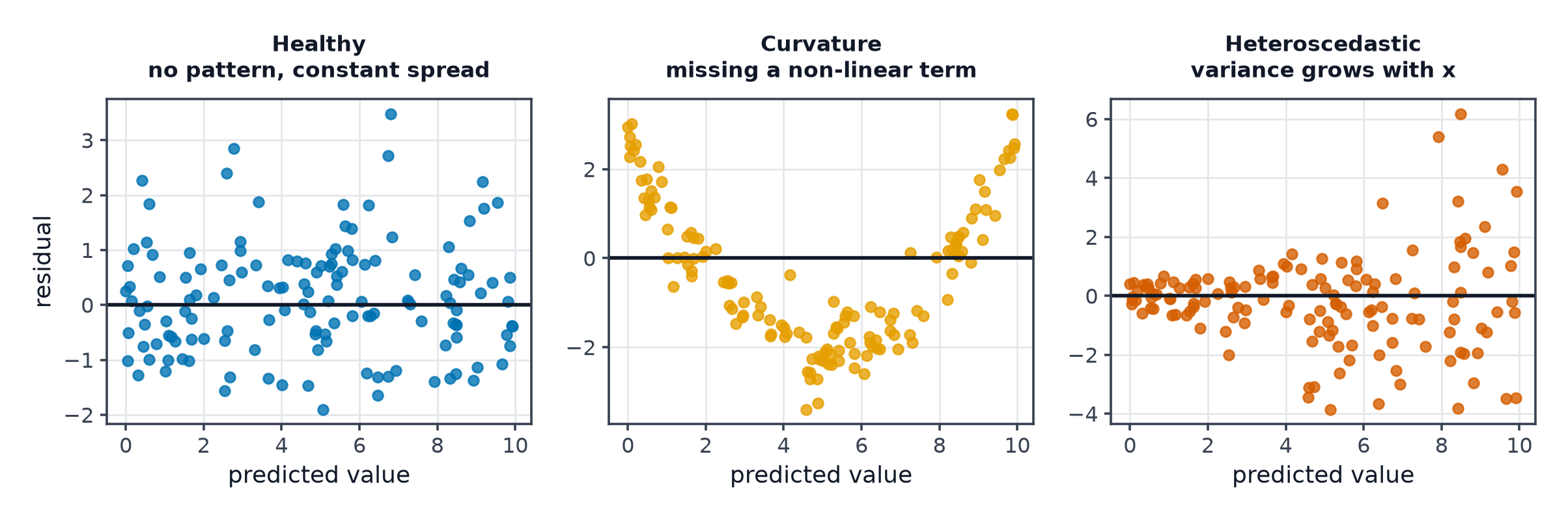
Plotting residuals () against predicted values or against each feature reveals problems no single number does: a curved pattern means the model is missing non-linearity; a funnel shape (residual spread growing with prediction) means heteroscedasticity, violating the constant-noise assumption behind squared-error losses.
Quantile loss for prediction intervals
Instead of predicting a single number, quantile loss trains a model to predict a specific quantile (e.g. the 90th percentile) of the target distribution — the basis of prediction intervals rather than point estimates:
Selection table
| Situation | Reach for |
|---|---|
| Outliers should dominate the score | RMSE |
| Outliers should not dominate the score | MAE |
| Need a scale-free percentage, no zero targets | SMAPE over MAPE |
| Want "fraction of variance explained" | R² (with residual plots as backup) |
| Need an uncertainty range, not a point estimate | quantile loss |
Code: metrics from scratch, a rank-flip case, residual plots
import numpy as np
import matplotlib.pyplot as plt
from sklearn.metrics import mean_squared_error, mean_absolute_error, r2_score

def mse(y, yhat): return np.mean((y - yhat) ** 2)
def rmse(y, yhat): return np.sqrt(mse(y, yhat))
def mae(y, yhat): return np.mean(np.abs(y - yhat))

rng = np.random.default_rng(0)
y = rng.normal(size=100)

# Model A: many small errors. Model B: mostly perfect, one huge miss.
model_a_preds = y + rng.normal(scale=0.5, size=100)
model_b_preds = y.copy()
model_b_preds[0] += 10  # one huge miss

print("Model A: RMSE=%.3f MAE=%.3f" % (rmse(y, model_a_preds), mae(y, model_a_preds)))
print("Model B: RMSE=%.3f MAE=%.3f" % (rmse(y, model_b_preds), mae(y, model_b_preds)))
print("-> RMSE ranks B worse (outlier-sensitive); MAE may rank B better (mostly perfect)")

# Verify against sklearn
print("sklearn check:", mean_squared_error(y, model_a_preds, squared=False),
      mean_absolute_error(y, model_a_preds), r2_score(y, model_a_preds))

# --- Residual plot: good fit vs heteroscedastic fit ---
x = rng.uniform(0, 10, 200)
y_good = 2 * x + rng.normal(scale=1.0, size=200)
y_hetero = 2 * x + rng.normal(scale=0.2 * x + 0.1, size=200)  # noise grows with x

fig, axes = plt.subplots(1, 2, figsize=(10, 4))
axes[0].scatter(x, y_good - (2 * x)); axes[0].set_title("healthy residuals")
axes[1].scatter(x, y_hetero - (2 * x)); axes[1].set_title("heteroscedastic (funnel shape)")
plt.savefig("residual_plots.png")
See also
- Evaluation Metrics for Classification — the classification-side equivalent.
- Loss Functions — MSE and MAE as training objectives, not just reported metrics.